
Museum Barberini App Redesign
Please note: this is a student project completed for the UX/UI Design Bootcamp at IronHack Germany. It is in no way affiliated with Museum Barberini or the Hasso Plattner Foundation.
THE ORIGINAL APP
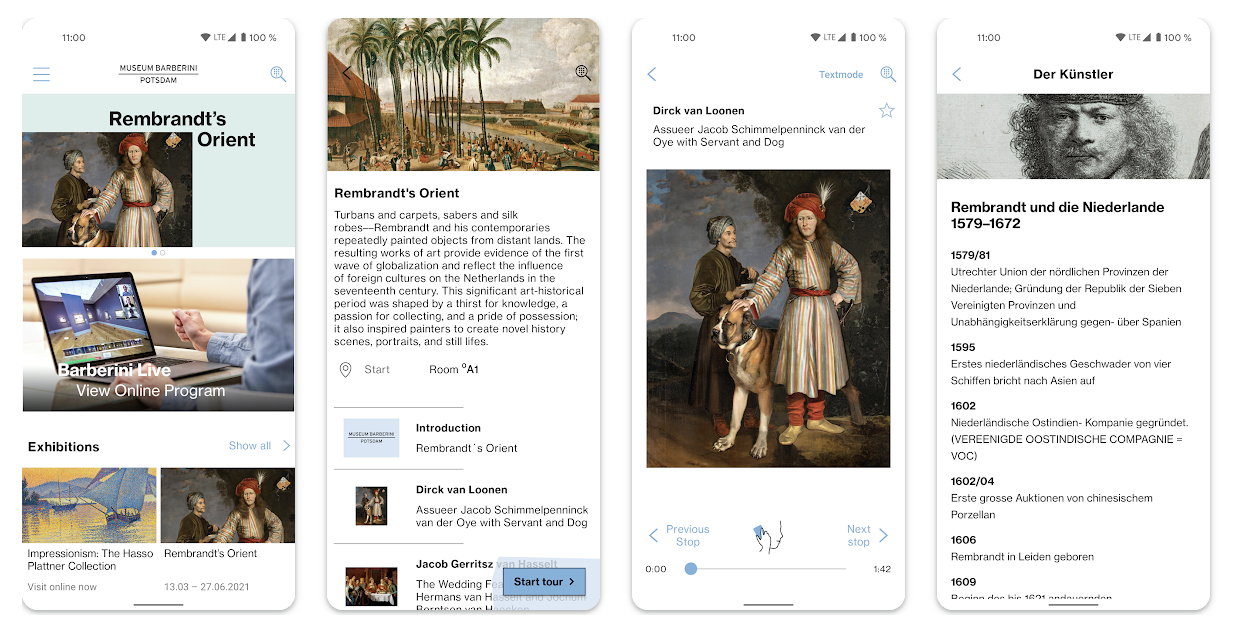
Museum Barberini App (on Android & iOS) is a 🎧 virtual tour guide that is free to download and accompanies the user while walking through the Museum Barberini, located in the centre of Potsdam, Germany.
I chose to redesign this app after downloading it once while visiting the Museum Barberini in the winter of 2023. The original version is quite plain and text-heavy with a poor organization of information architecture. I also chose a color palette that reflects the theme of nature as embodied by the Impressionist paintings in its permanent collection and natural landscape, as it sits directly on the Havel River.
SECONDARY RESEARCH
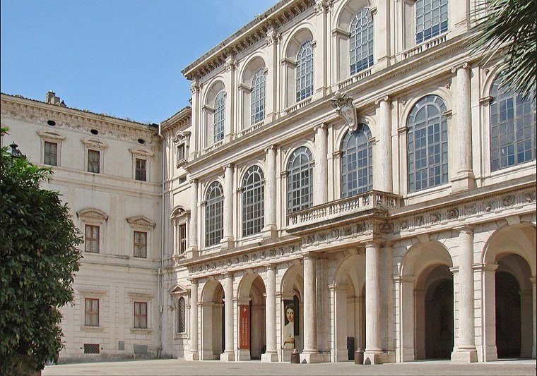
pALAZZO bARBERINI, ROME.
After doing some preliminary research about the Museum Barberini, I learned that its Baroque architecture and archways was inspired by the Palazzo Barberini (of the same name) in Rome, which contained a pattern of curvature and circular elements as reflected in nature and the Golden Ratio. I created a moodboard to gain visual inspiration for my interface design, which you can see below.
COMPETITOR ANALYSIS
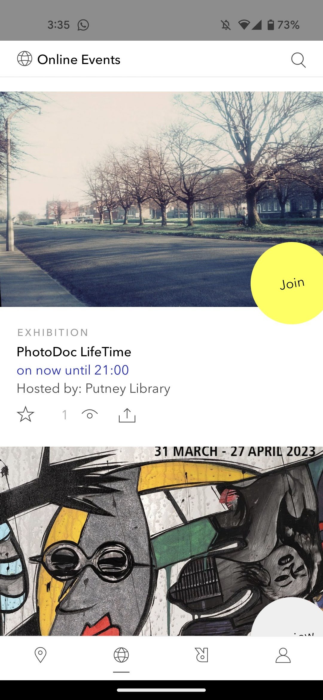
There are a handful of museums and art galleries that currently offer mobile audio guides. These are just a few of the competitors that I analyzed - from L-R: ArtRabbit, Hamburger Kunsthalle, La Sagrada Familia, and the Van Gogh Museum. Overall, I preferred that these four apps offered more visually-appealing media as content, offered the user a more interactive experience whie walking in-person through the exhibitions, a chatbot providing FAQs about the artwork and provided social media integrations so the user could share their experiences with friends and followers.
MOODBOARD

On the left, I have included a photo of the signature archways of the Palazzo Barberini and a photo of the curved staircase in the main entrance. I have also included two of Museum Barberini’s featured Impressionist paintings, Paul Signac’s “The Port at sunset, Opus 236 (Saint-Tropez),” 1892 (top center), and Claude Monet’s “Impression, Sunrise,” 1872. On the right, there are a few photos of the Havel River in Potsdam, showing a view of the Museum Barberini right by the water.
Water and nature seem to be a significant theme within the interior of the museum’s painting landscapes and also in its interior architecture, allowing in lots of natural light with its ceiling to floor windows on the main floor with a view of the river on the main floor.
STYLE TILE


Based on my research of the museum’s interior spaces and its location in nature, I decided to settle for these neutral color tones. For my color palette, I decided to highlight water using turquoise tones as a primary color to signify links and call-to-action buttons and muted, netral tones as secondary colors for text to imitate the reflection of sunlight off the water.
I chose Roboto, a sans serif font for the Heading and Body and opted for an italicized serif font, Old Standard TT for the subheading.
With these colors, I wanted to evoke a sense of tranquility, serenity and poetry, focused on idyllic travels and using the Golden Ratio principles of design.
Baroque archways are also a very identifiable and prominient architectural aesthetic of the Museum Barberini’s facade and ground floor interior, so I decided to include them as part of the logo redesign in the muted brown colors to imitate the “M” of Museum. As the previous logo was a simple sans serif font, it lacked memorability and color, I chose the warmer brown and beige tones to create a new mobile app tile. Using the capitalized ‘B’ letter in the font family, Inspiration, I combined the two letters “M” and “B” to create the tile you see on the far left.
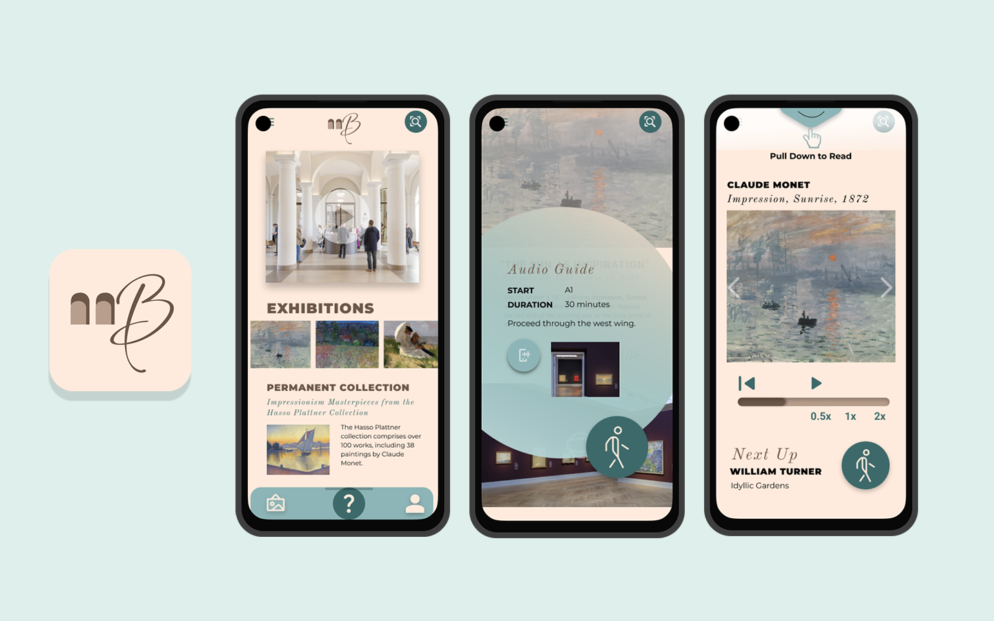
WIREFRAMES
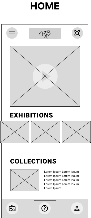
Using a heuristics checklist, I decided to focus on redesigning a typical guided audio tour, while walking through one of the museum’s exhibitions.
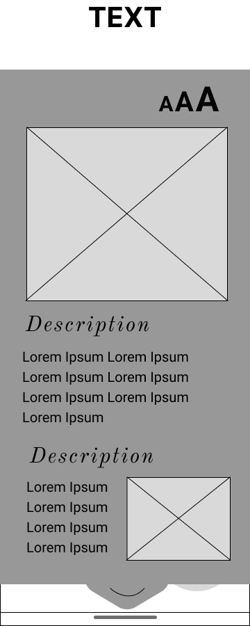
The user begins on the homepage where they will see all the exhibitions, including the permanent collection.
There is also a sticky navigation bar containing the following links: all collections, ‘Help’ button, and a Profile section with saved data.
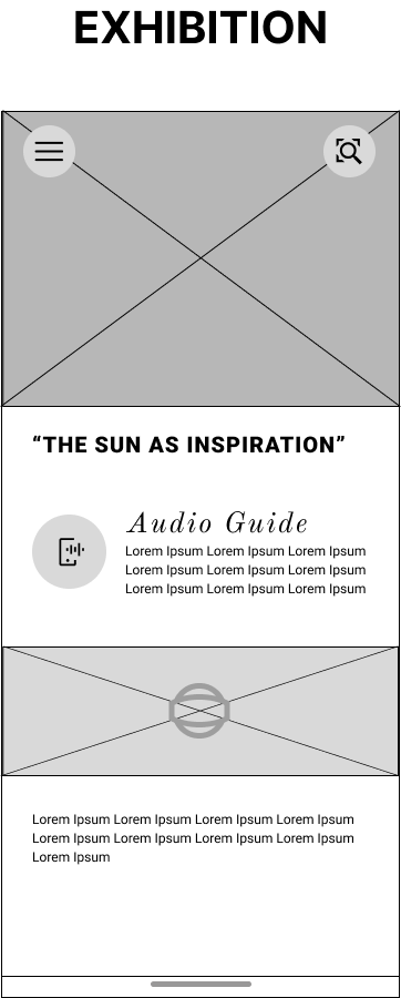
They click on the first exhibition photo which brings them to the first page of the exhibition.
There is a mini description of the exhibition, including an audio guide section and panoramic view of the entire gallery.
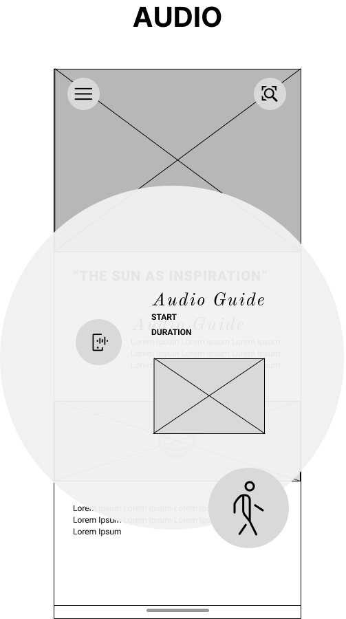
The user clicks on the audio button and a pop-up appears of the audio guide.
They click on the ‘Walk’ button to start the tour.
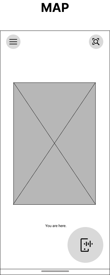
The next page shows a map of where they are currently located in the museum. The user clicks on the ‘Listen to Audio’ button.
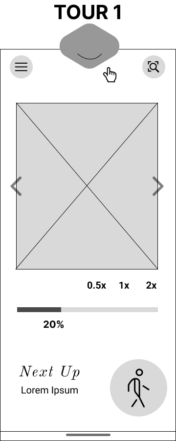
The first page of the audio guide shows a carousel of images of the first featured painting. The user can play and pause the audio, viewing a progress bar of how far they are in the tour. They can also choose the speed of the audio. There are instructions indicating for the user to pull down the tab from the top, where a screen with the text-to-speech script is available to read as an accessibility option.
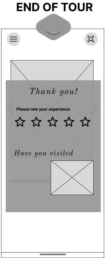
Upon completing the tour, a pop-up window appears with a star rating review for the tour.
HI-FI PROTOTYPE
Through the process of concept and usability testing, I experimented with the size of the call-to-action buttons, font family of the main body text, and also the colors and the fill style of the sticky menu and pop-up windows.
I also faced the challenge of displaying the “Pull down to Read” prompt at the top of 5th page, instructing the user to pull down the screen to read the audio-to-text script. I decided to add a translucent, white layer that makes the turquoise tab stand out even more.
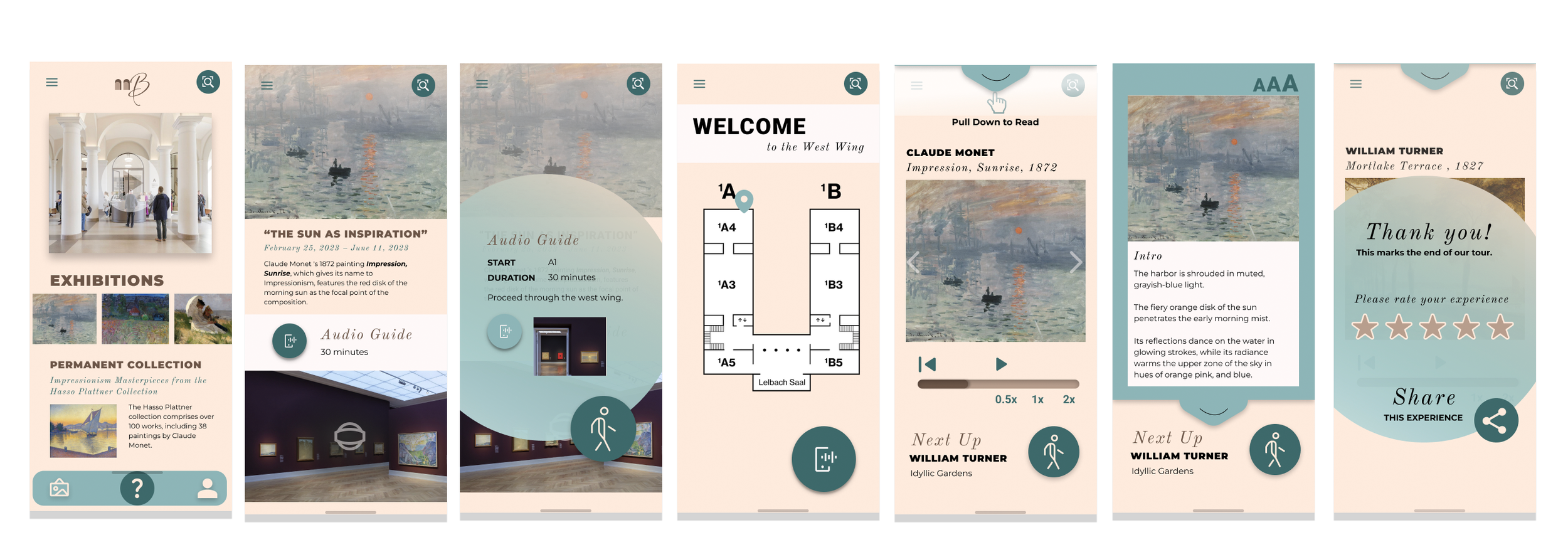
Hi-fi Prototype
NEXT STEPS & KEY LEARNINGS
Overall, I really enjoyed this project and am very content with the overall app redesign and brand redesign process. I received very positive feedback of the overall aesthetic, including that the color palette is suitable and matches the theme appropriately without looking outmoded.
Test on More Users
Following this hi-fi prototype, I would like to test the user flow on more users to determine if they are more stimulated by the colors and can clearly navigate their way through the app with ease and accessibility.
Include a Ticket Booking Option
I would also like to include an additional feature to pre-book tickets for upcoming exhibitions in advance directly on the app, rather being re-directed to the museum’s website, which is what the original app does currently.
Include a VR Interactive Option
I would like to include an interactive, gamified option to view exclusive information about the museum’s exhibitions directly on the user’s phone as they navigate through different rooms in the museum.
