
BE LIGHT APP
SCOPE
BE LIGHT is a startup founded in Berlin by co-founders, Ivo Vossen, Oliver Smykacz, Ahilan Sundaralingam and advisor, Pascal Morgan. I joined the team in early 2024 as a UX/UI Designer and Communications & Branding Specialist.
The product, using neuro-optimized light and sound healing frequencies, also known as audiovisual entrainment (AVE) are experienced by the user via device screen [mobile device, laptop screen, desktop monitor, projector screen.] Their verticals include a web and mobile app, live events at conferences and wellbeing spaces, and a corporate well-being program that includes live sessions online and in-person.
As BE LIGHT was transitioning from a B2C-sales focus to more B2B with the the introduction of their corporate well-being program for teams, they needed to revamp their user interface on the mobile and web app and overall branding on external communications to match the professionalism of market competitors in the wellness industry of the DACH region.
My responsibilities and tasks include but were not limited to the following:
BRAND & WEBSITE:
updated brand guidelines to reflect a modern feel and attract the company’s current user demographic
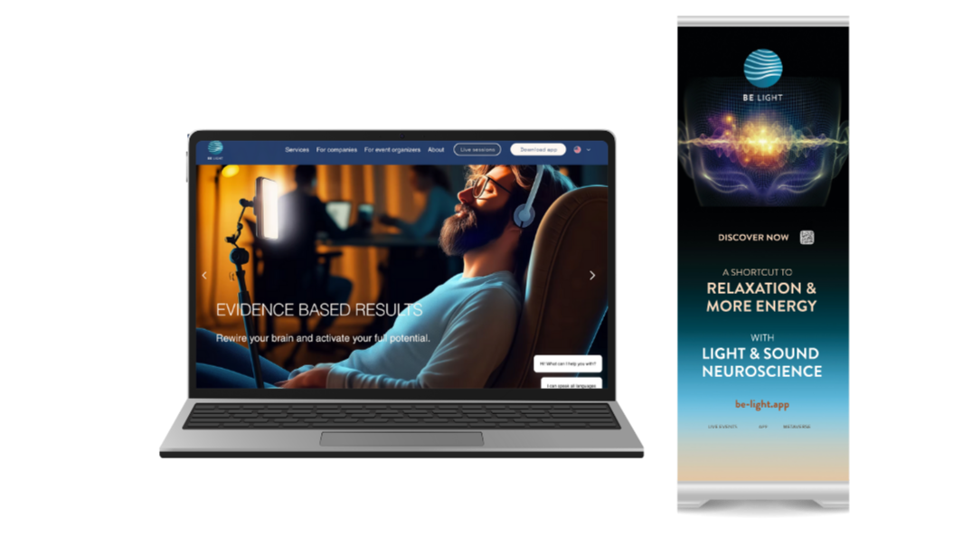
designed new printed merchandise and displays (banners + postcards) to reflect promotional offers
launched website reflecting new brand visuals and design as primary platform to communicate B2B client inquiries
APP:
redesign the app interface’s to enhance more intuitive usability, user personalization, and clarified user goals
increasing user downloads and retention
performing user interviews and user testing to improve the user experience and retention of app
conducting market research and competitor analysis of other meditation apps in the DACH region
reviewing user data analytics to improve structure of BE LIGHT sessions and how they are organized in an easy-to-use format
collaborated with developers to define new features of the app such as profile screen, live team sessions, downloads screen, and promotional offer screens
redesign of the app’s App Search Optimization graphics to increase app downloads from the iOS and Google Play stores.
Moodboard & Brand
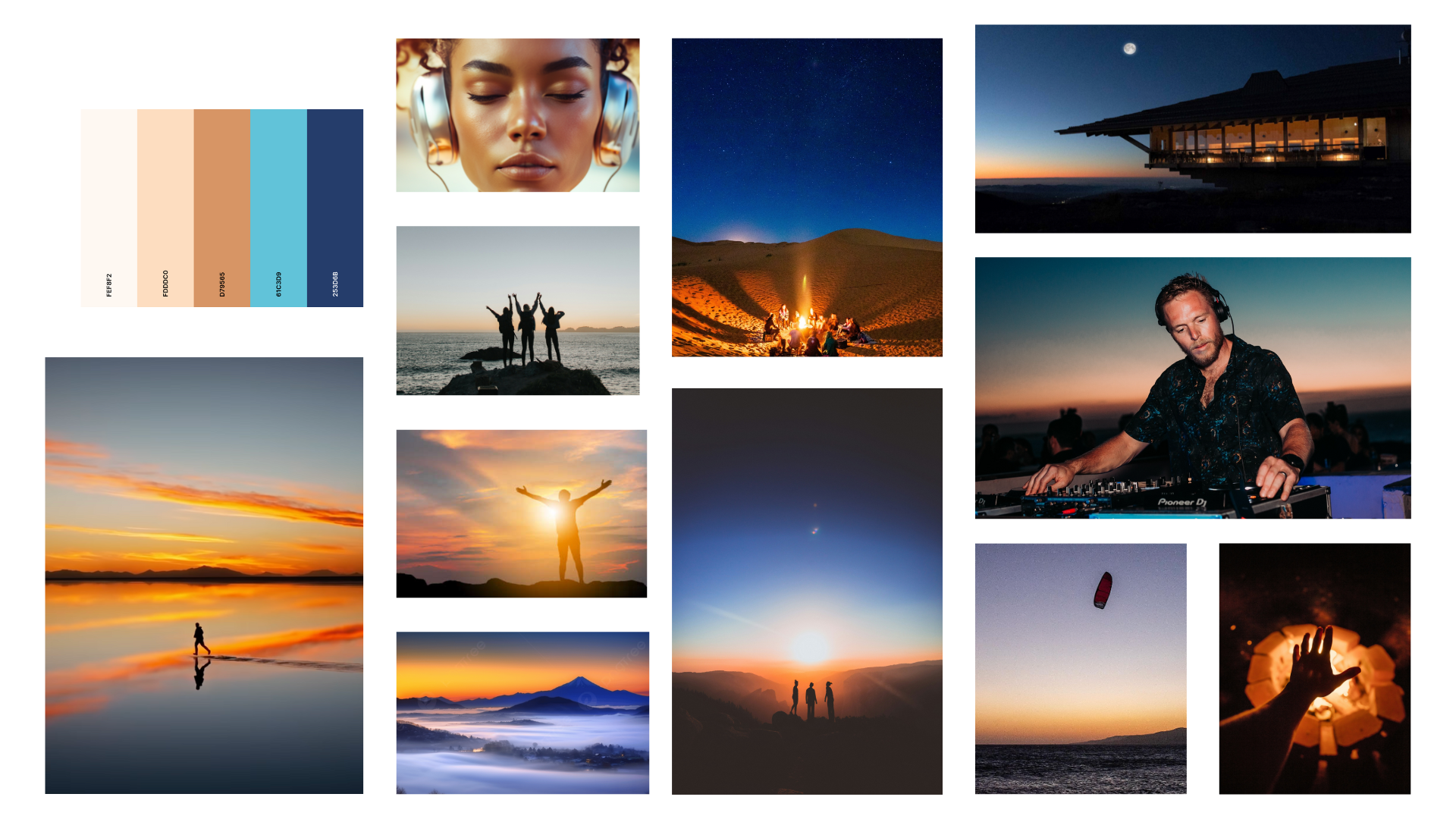
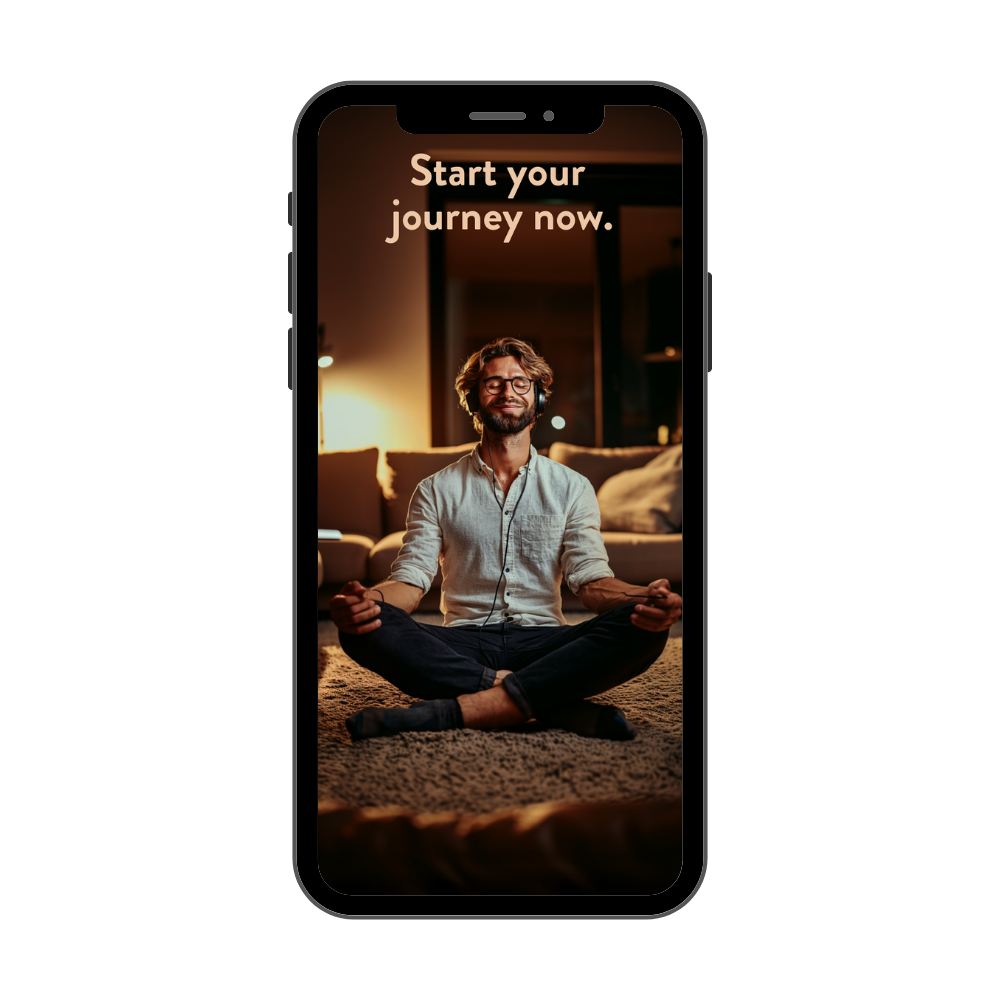
Inspired by golden sunsets overlooking the ocean or by the mountains, I wanted to recreate the feeling of ‘awe’ and magnificence using warm tones of beige, gold, white light and dark blues and turquoises. While technology and AI advancements are prominent in the production of the light and sound frequencies, the brand voice of BE LIGHT is one that conveys a powerful return to nature and a collective energy that resides in each and every human being and living organism. This color palette and imagery of nature is used to invoke energy in their clients and communicate a professional, trustworthy, and relatable tone that is down-to-earth and approachable.
User Personas
As BE LIGHT was transitioning from a B2C-sales focus to B2B with the the introduction of their corporate well-being program for teams, I drafted two main user personas whom would have the most buying power, investing in the services of BE LIGHT. Common characteristics of these users include having a busy lifestyle working in tech ad not having enough free time to disconnect and take rest for themselves in their personal lives. Their main challenge includes being able to adopt a new digital habit such as using the BE LIGHT app 2-3 times weekly in order to see regular benefits of reduced stress levels, more regulated moods, and balanced energy levels throughout their work week.
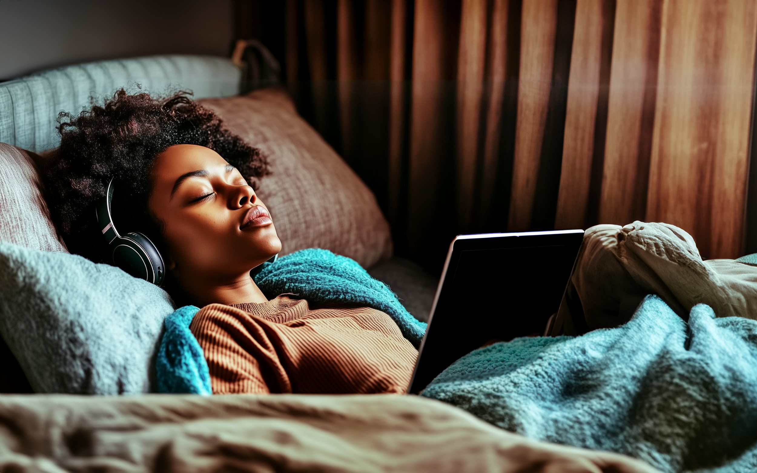
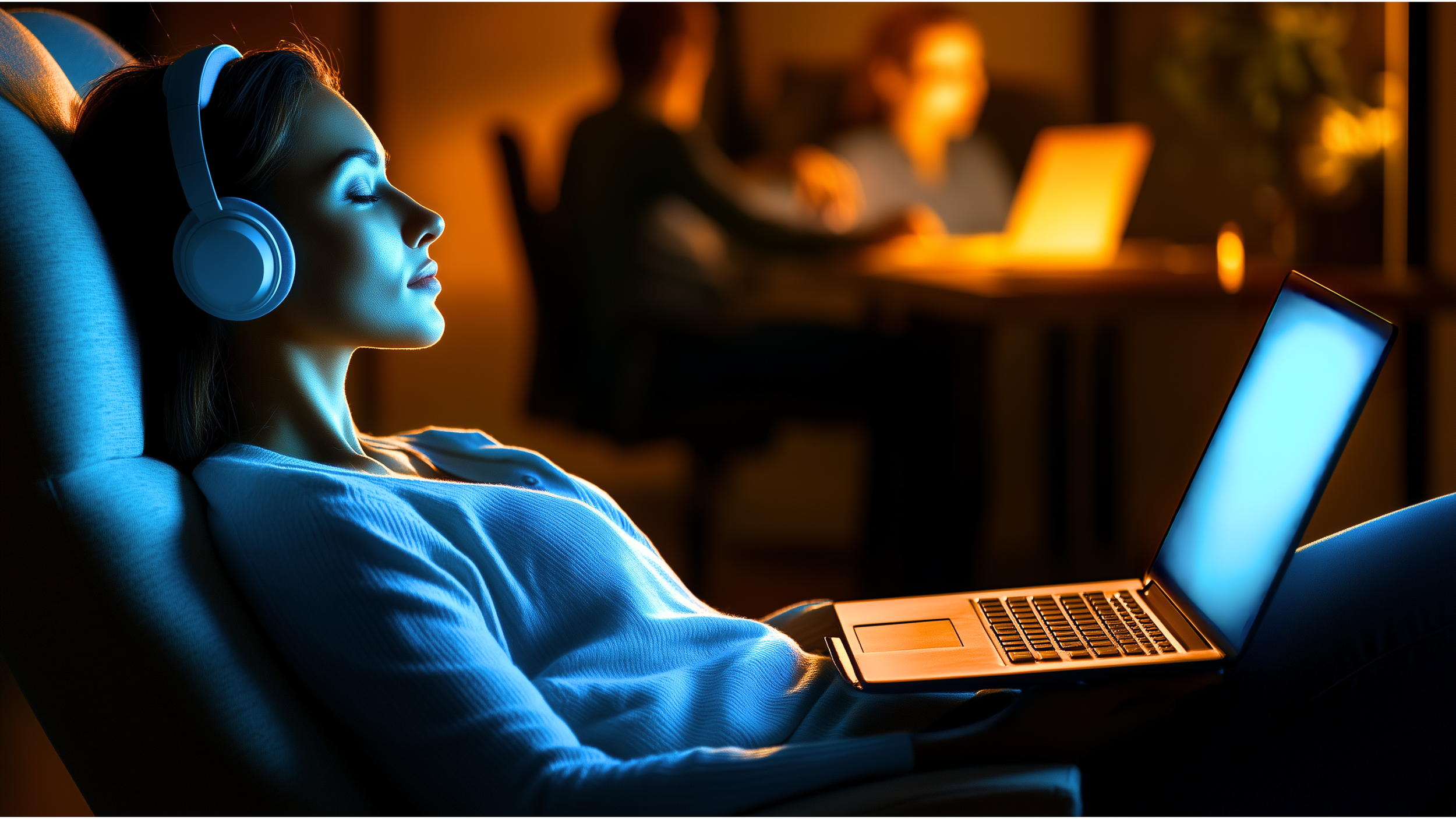
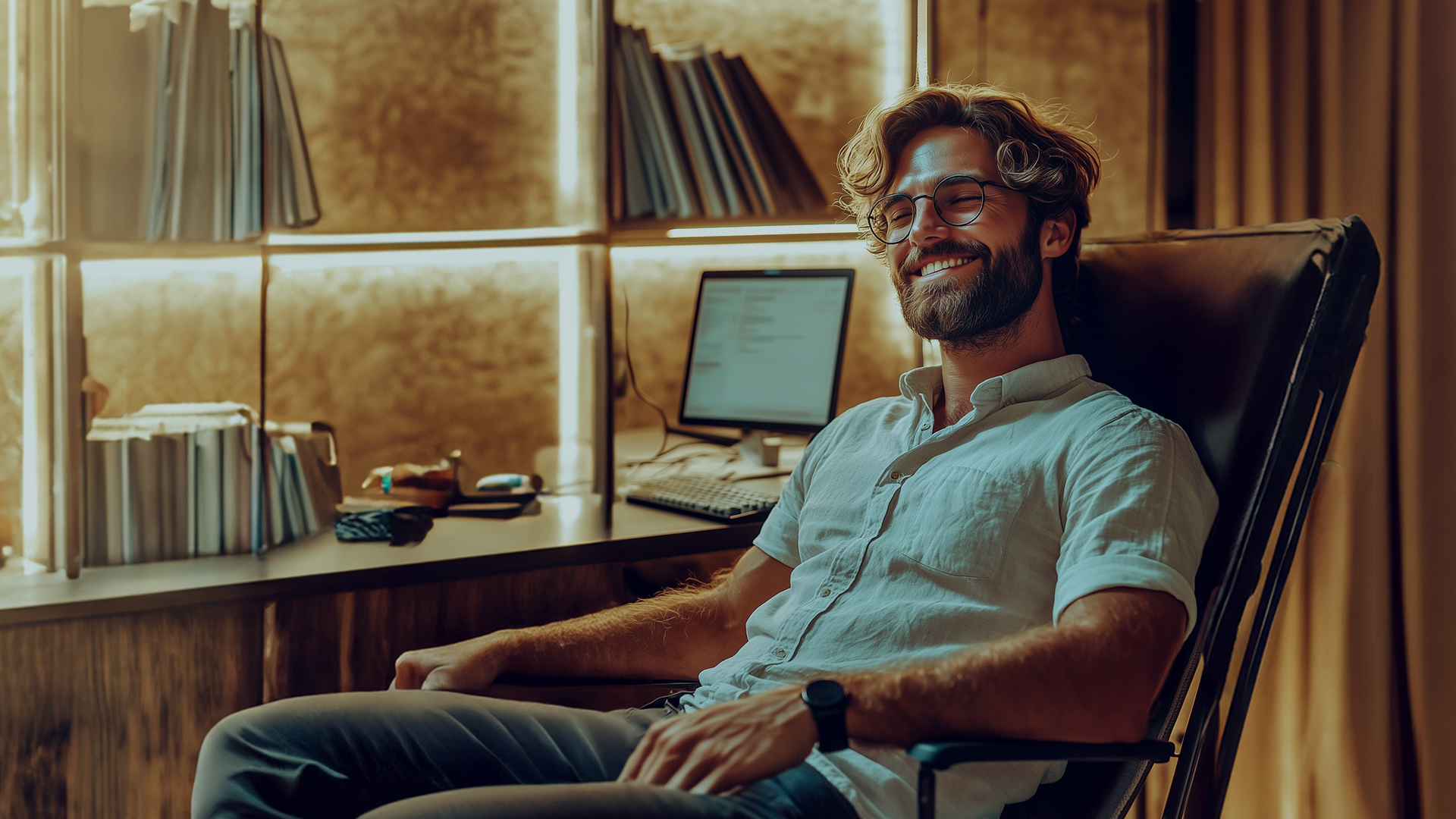
Website & Brand Identity
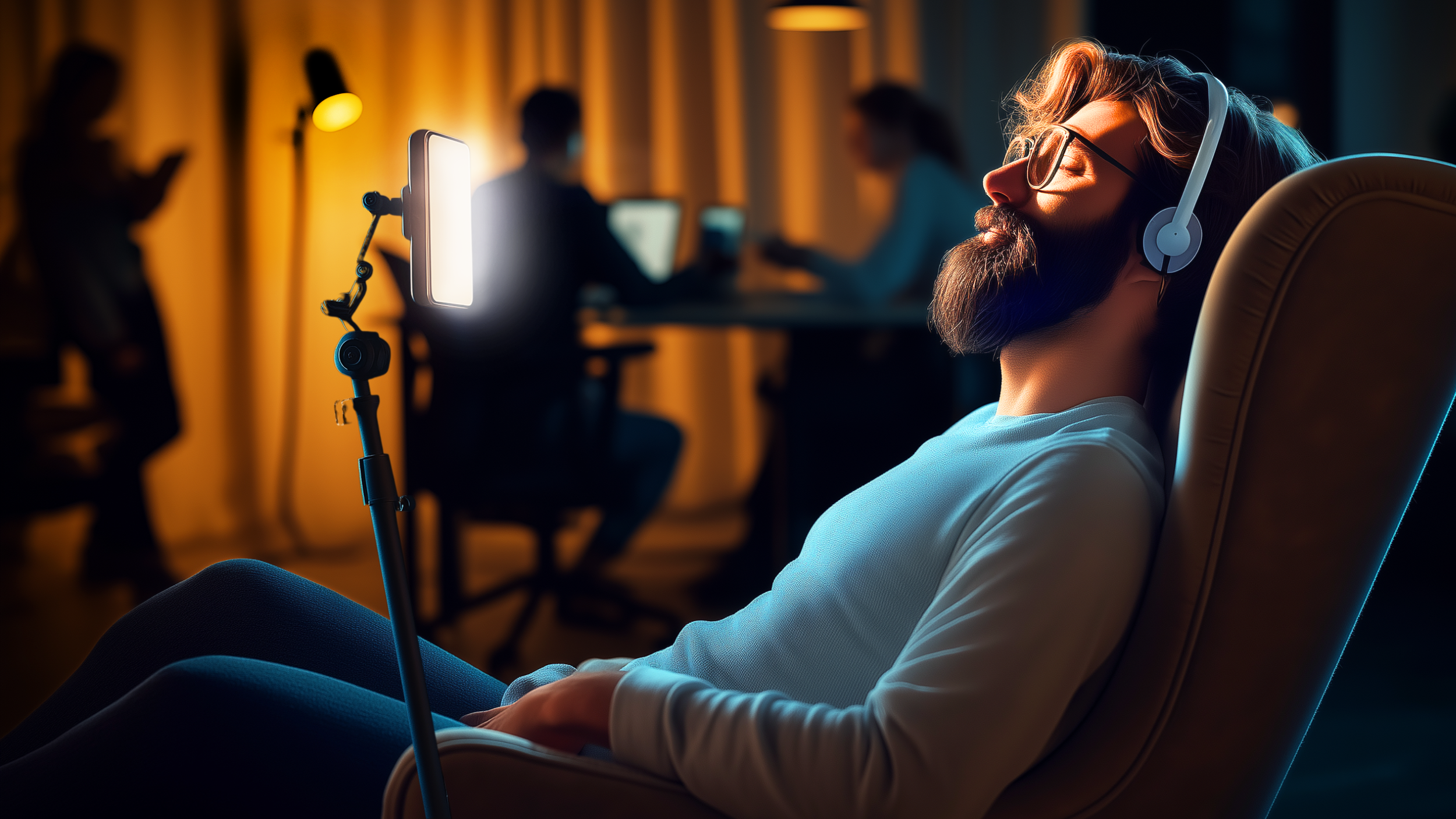
Based on our user personas’ needs, we wanted to convey a professional tonality in our communications to provide a more realistic and educational approach rooted in science. We opted for visuals showing the practical use case scenarios of BE LIGHT’s light and sound healing sessions via devices found at home: mobile devices positioned on a tripod, tablet screens placed on a pillow, laptop screens propped on a blanket, etc, using characters created with GenAI to illustrate our ideal corporate client. By identifying as our “hero” or “heroine,” the user is able to realize how accessible the process of relaxation and finding micro-breaks to reset their nervous system can be, simply by accessing their BE LIGHT sessions from their device screen at home or at work.


Website (Continued)
In addition to building out the site map and organizing the wire frames for all of the subpages of the BE LIGHT public website (including the blog, team page, science page), I also created members-only landing pages for our corporate wellbeing program clients. Employees of our clients would access these landing pages to view a video of an online team-building workshop, and access information such a presentation slide deck, set-up information for their light and sound session, and QR codes to download the BE LIGHT app on their mobile devices.
App Search Optimization Graphics (ASO)
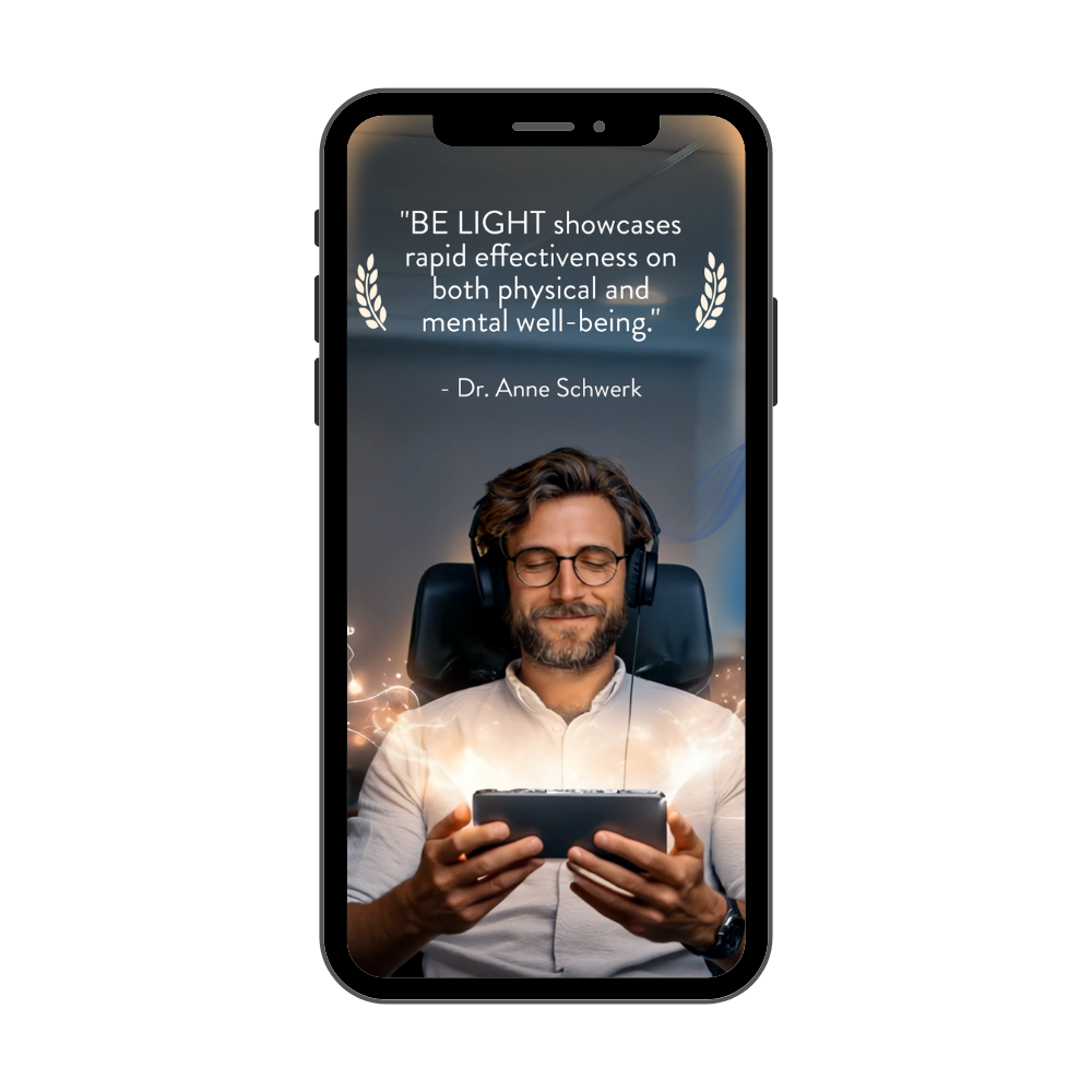
After working on the brand’s redesign, I created graphics for the iOS and Google Play app stores to reflect the current app’s interface design. The clean and modern aesthetic along with social proof of app validation (testimonial) creates a more professional and trustworthy appearance in a highly saturated market of wellness-based apps.
Along with updating the ASO keywords in the app description’s copywriting, the BE LIGHT Meditation App now has higher visbility in its search and algorithm ranking, leading to better user targeting of a more professional audience, app engagement and thus better conversions of app installations.
UI Features & Usability
I worked closely with the Head of Product and full-stack developers to create the prototypes for several app features that were published for production. These included:
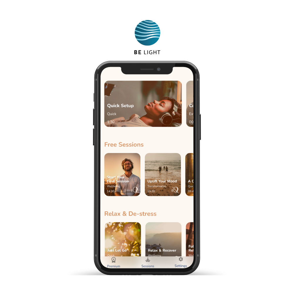
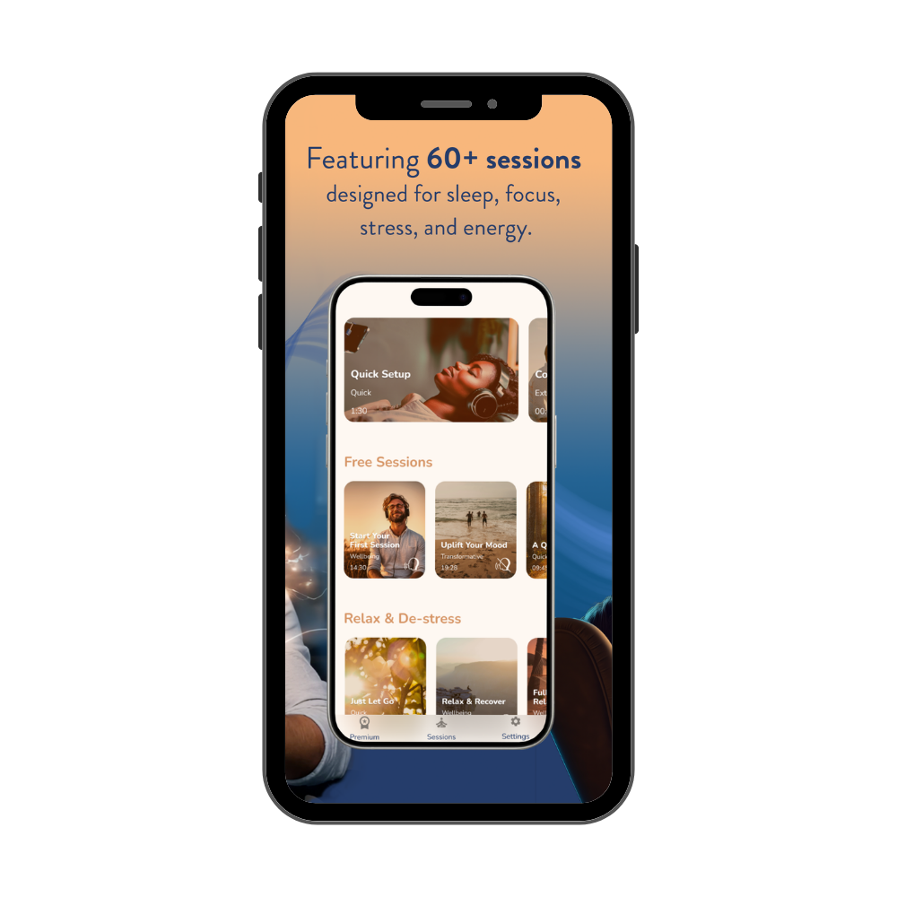
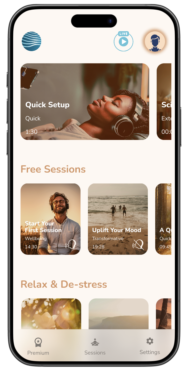
Redesigning the home screen’s session cards of 20+ light and sound sessions reflecting the new brand colors and imagery
Enhanced the user’s profile screen to include a dashboard demonstrating user behavior over time
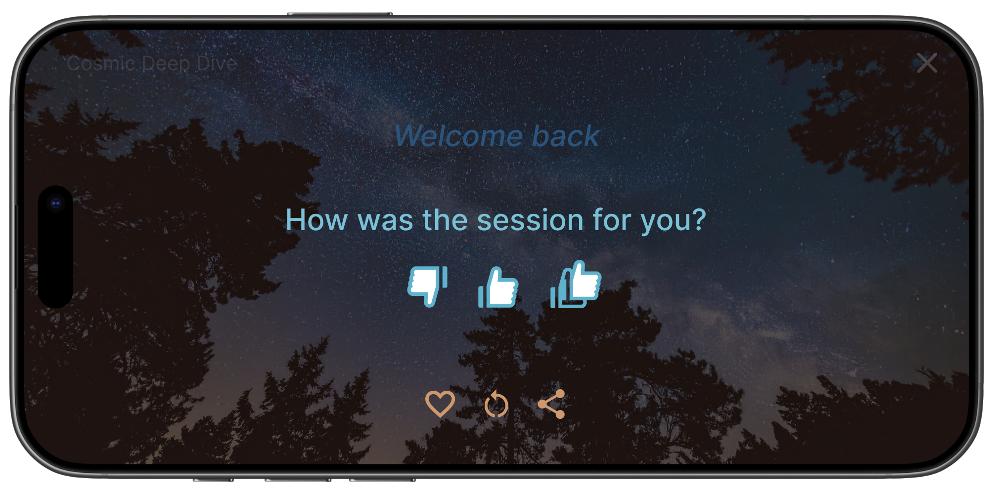
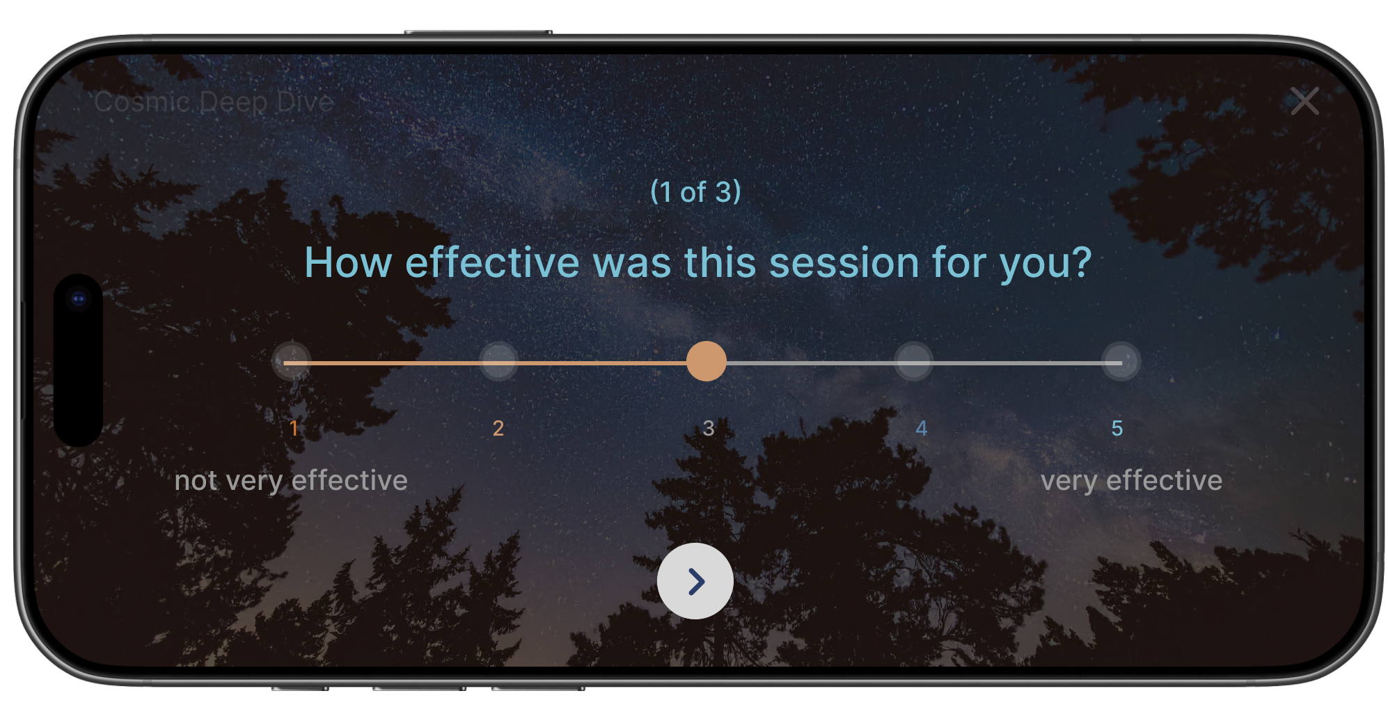
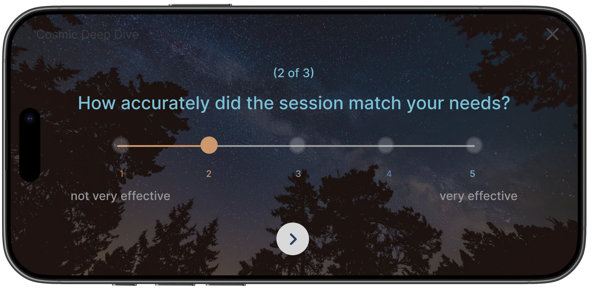
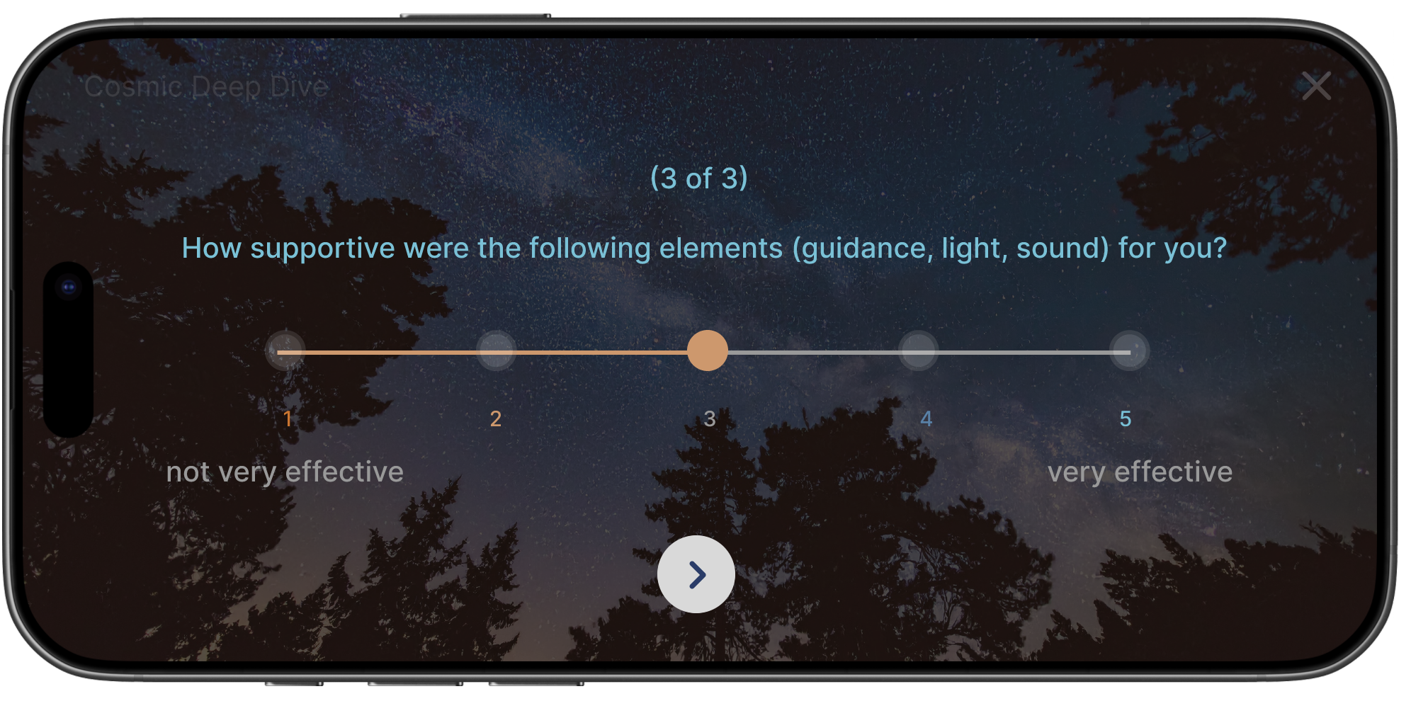
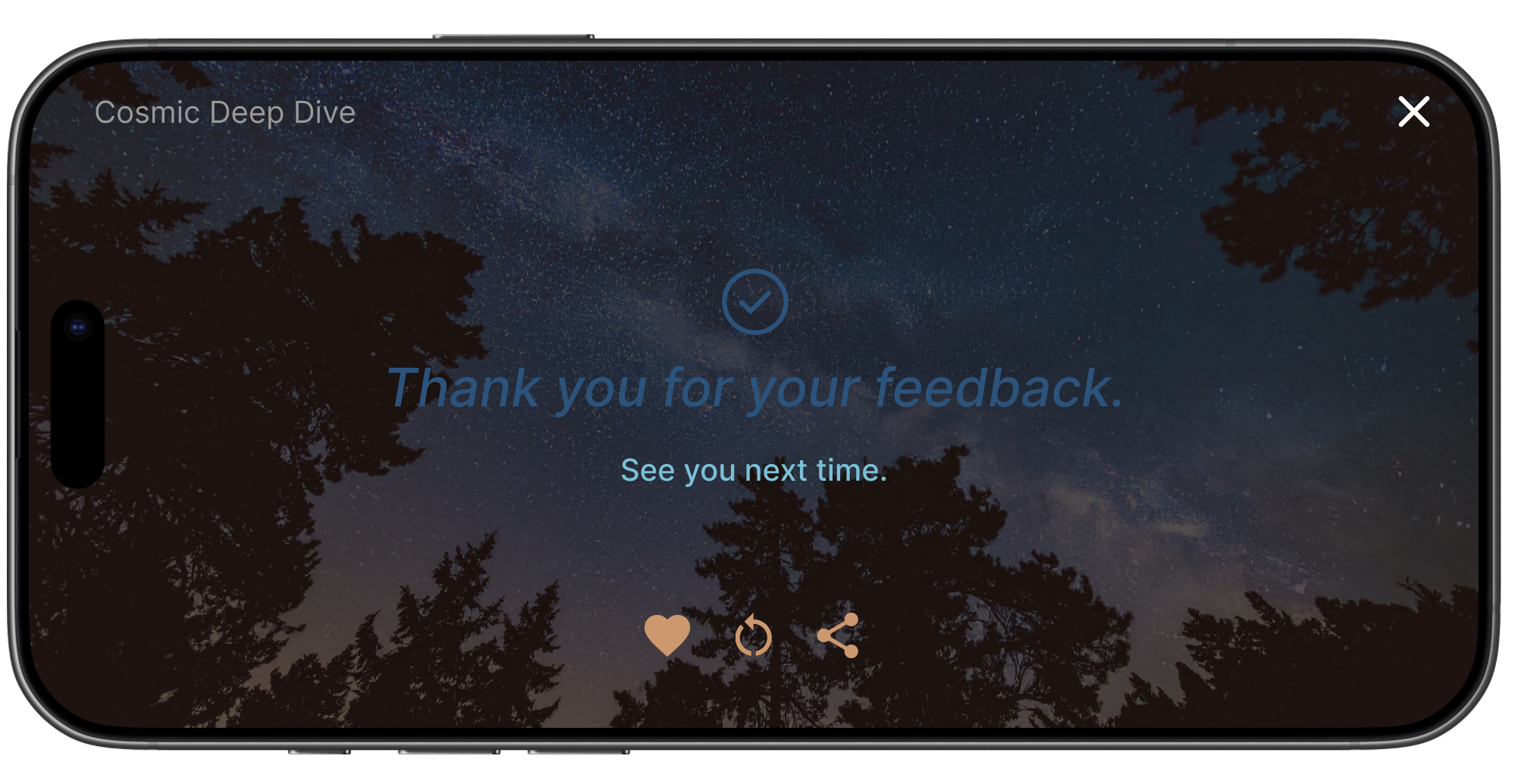
Improved the session player controls and implemented post-session surveys to generate real-time user feedback
Created the user journey and mockup for new user onboarding from app installation to creating a new account
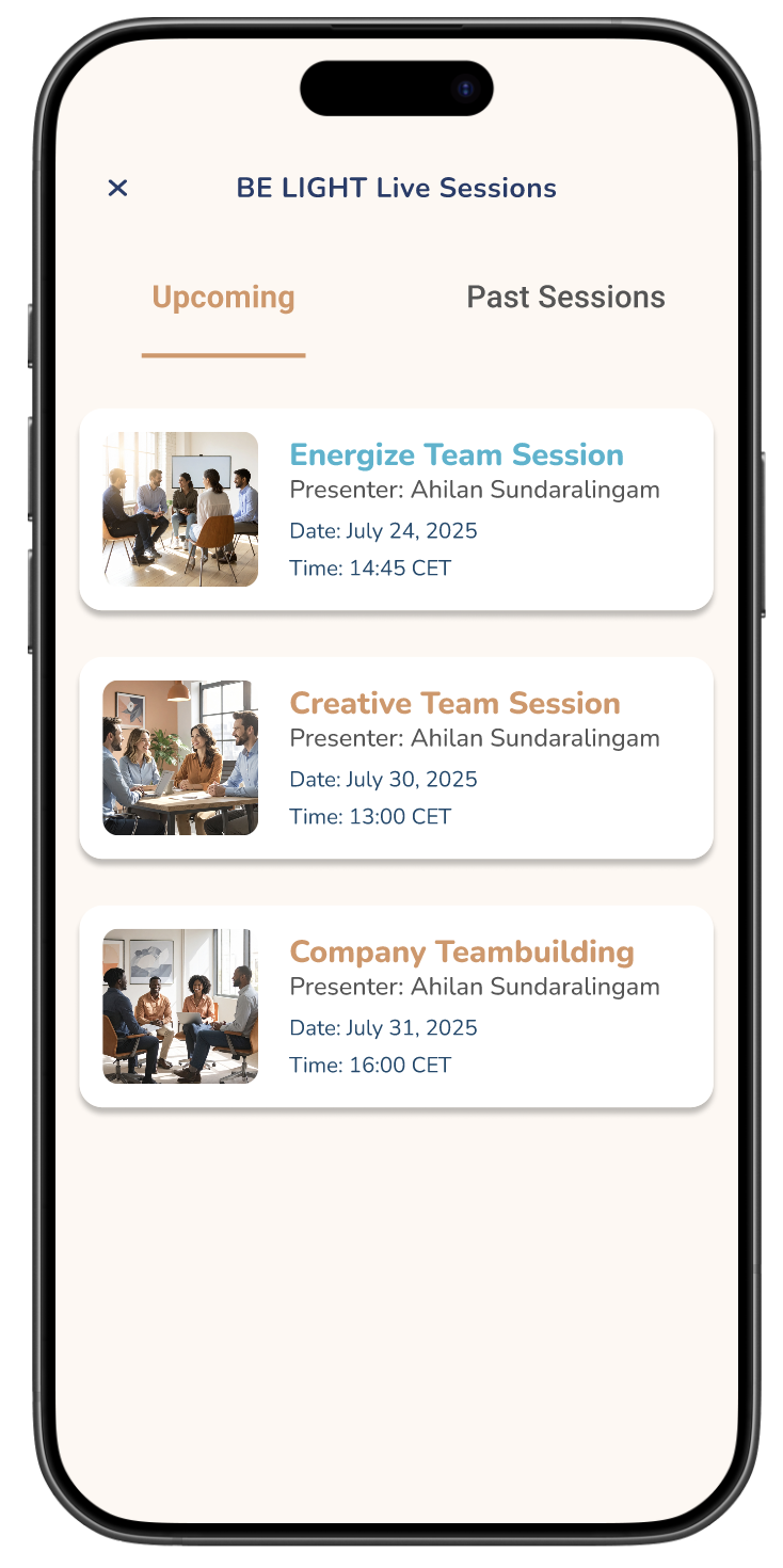
Along with creating the downloads page and live team sessions page
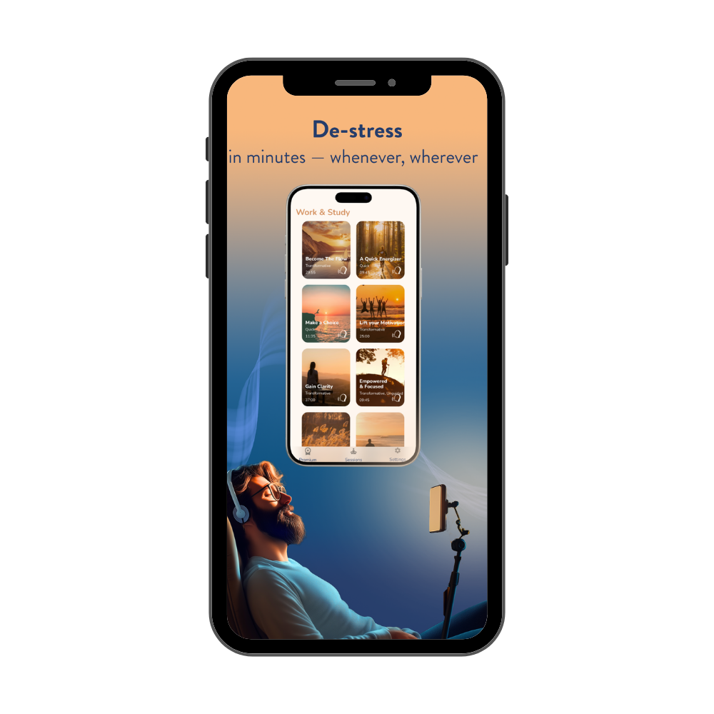
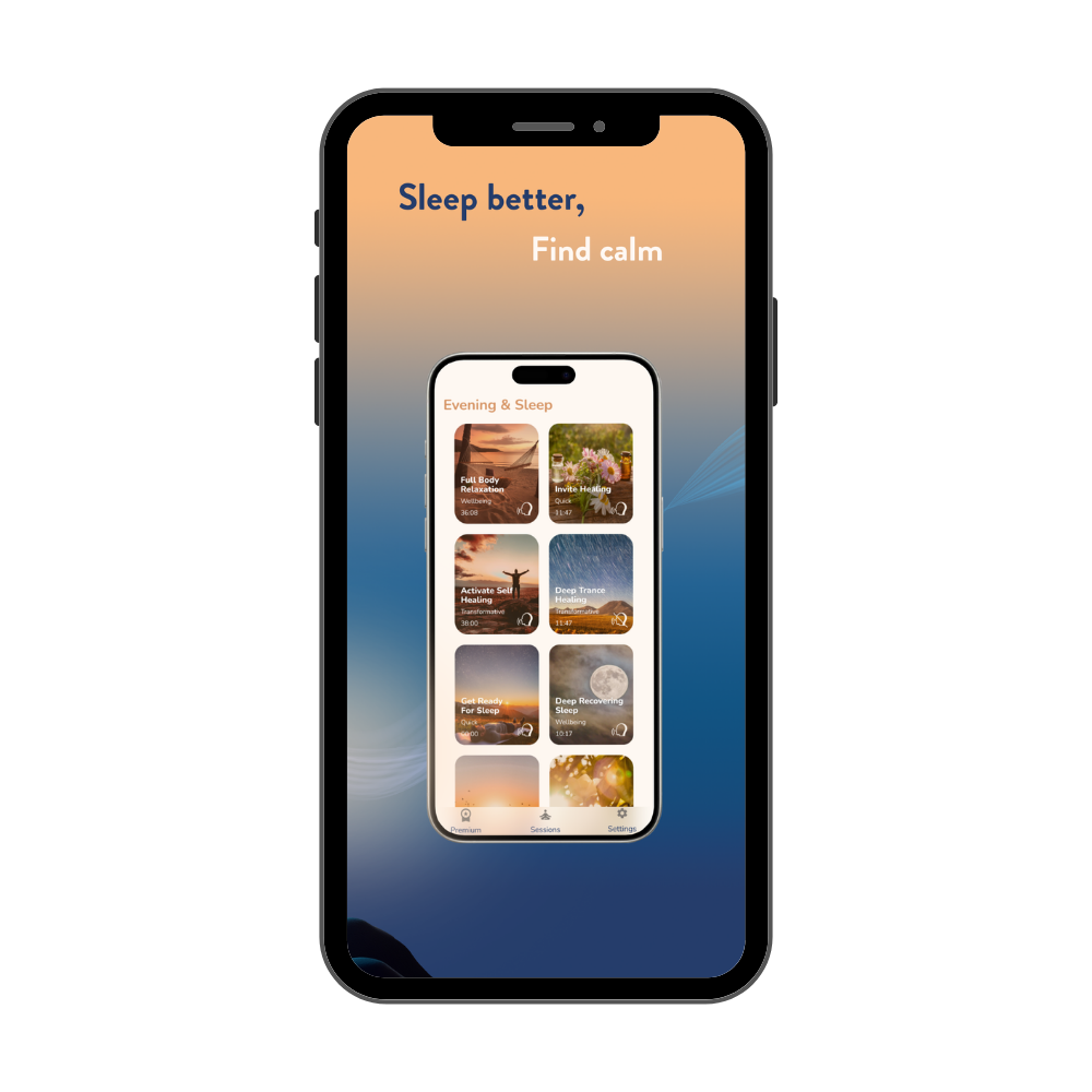
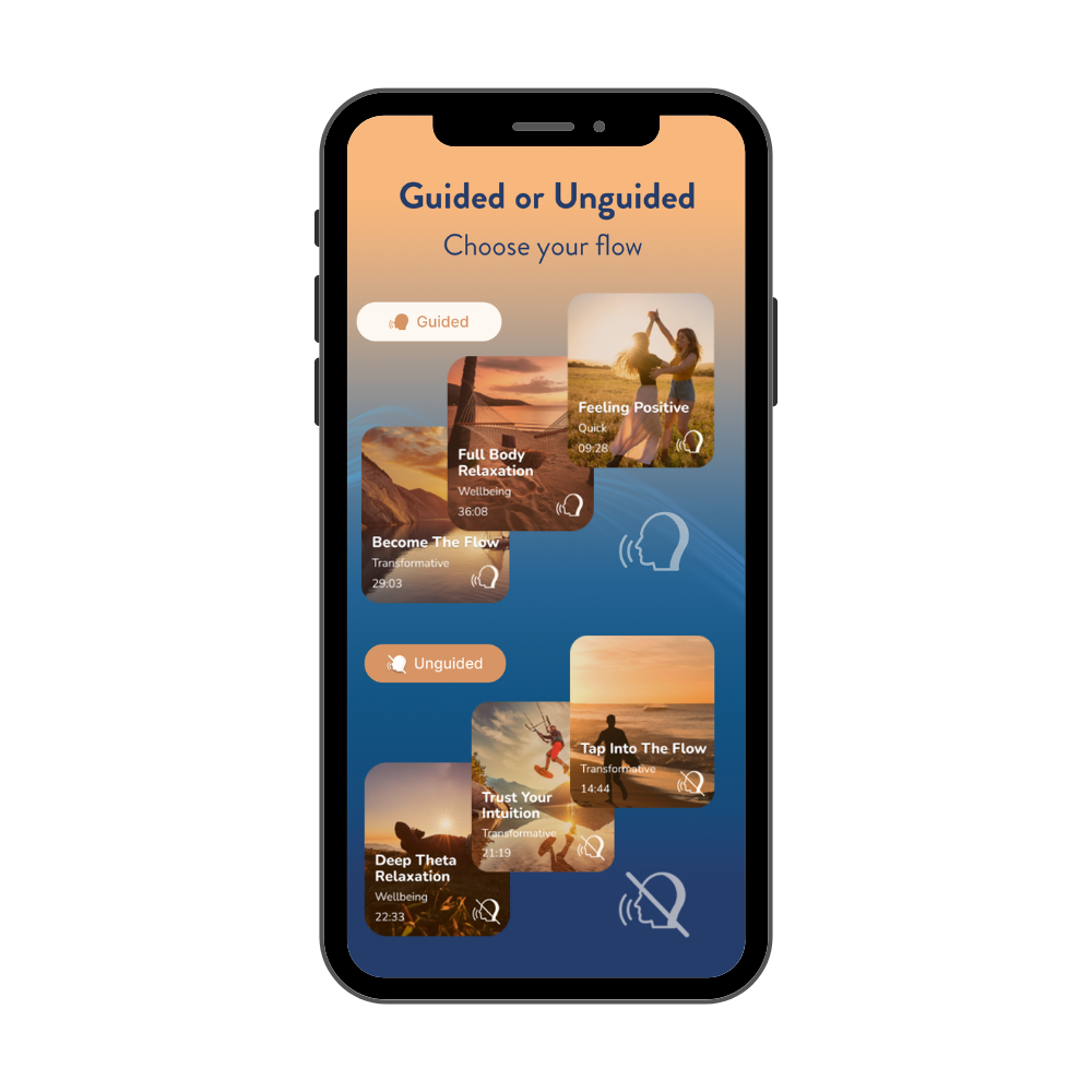
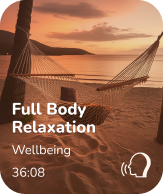
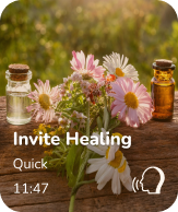
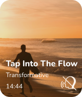
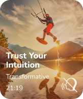
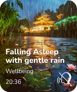
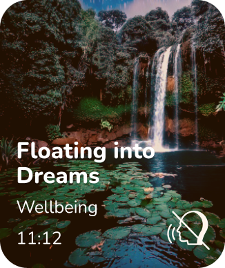
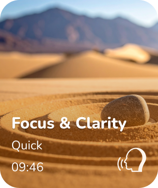
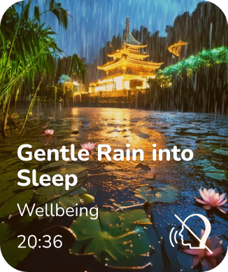
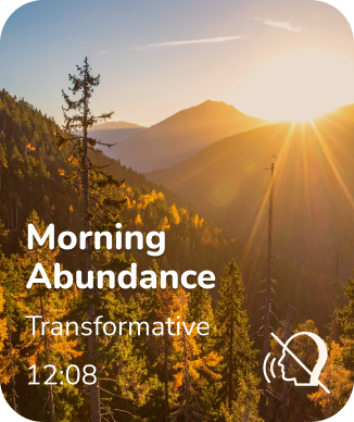
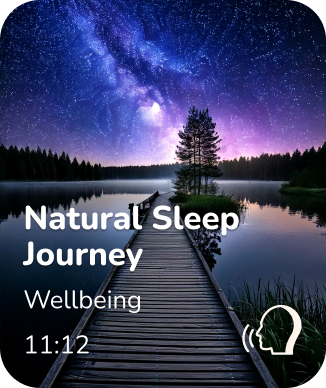
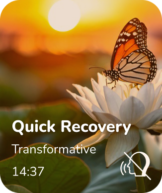
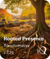
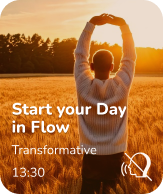
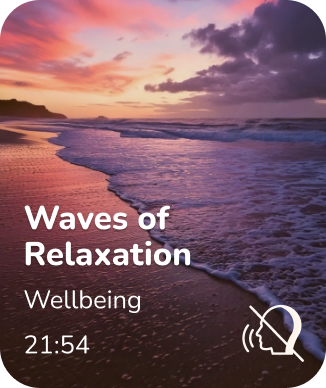
Homescreen & Session Cards
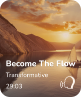
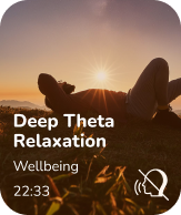
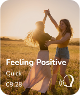
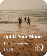
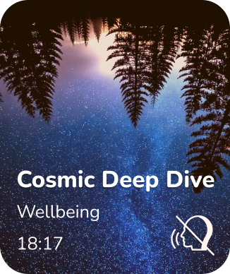
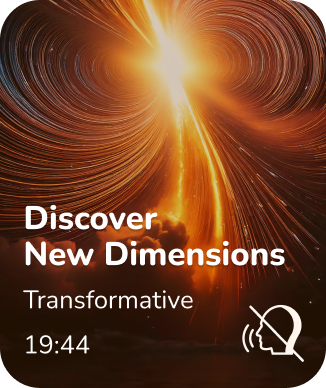
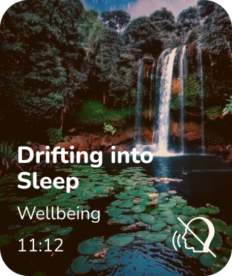
All 20+ light and sound sessions were given a new session card design, using imagery to illustrate the theme and session description and thus improving user retention. Modeled after realistic scenes in nature, these images were developed using GenAI and curated together to create a seamless look and feel. Each of the session cards follows the same structure:
Session Title (text)
Session Type (text)
Duration Time (text)
Guided or Unguided (symbolized by an icon)
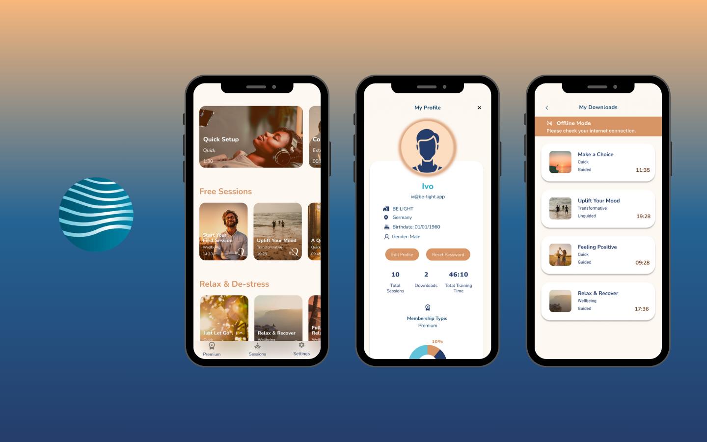
Profile Screen & Dashboard
Designing the Profile Screen is an important feature because it provides a personalized experience for the user to track their activity, measure their behavior, and highlight their preferences and goals while using the BE LIGHT app.
The dashboard provides insights for the user to build better mindfulness habits without being performative or competitive in their progress. Patterns in consistency, session length, and timing allow the user to identify the optimal session duration for maximum benefit.
There are two modes of the profile that I designed (L: Private and Follower-only View) and (R: Public View), where the user can opt-in to being visible in a community supported platform. By acquiring followers, the users can build accountability with users of similar goals, create virtual teams amongst corporate companies, and motivate each other with public milestones of their progress.
Following every session, the user is asked to provide their feedback on their experience, which further supports implementation of future features such as journaling reflections, guided insights, or adaptive recommendations of new sessions which will be shown here and on the homepage.
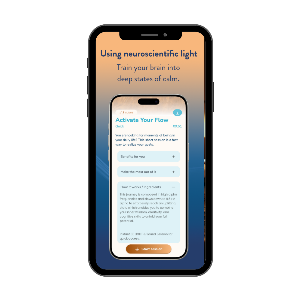
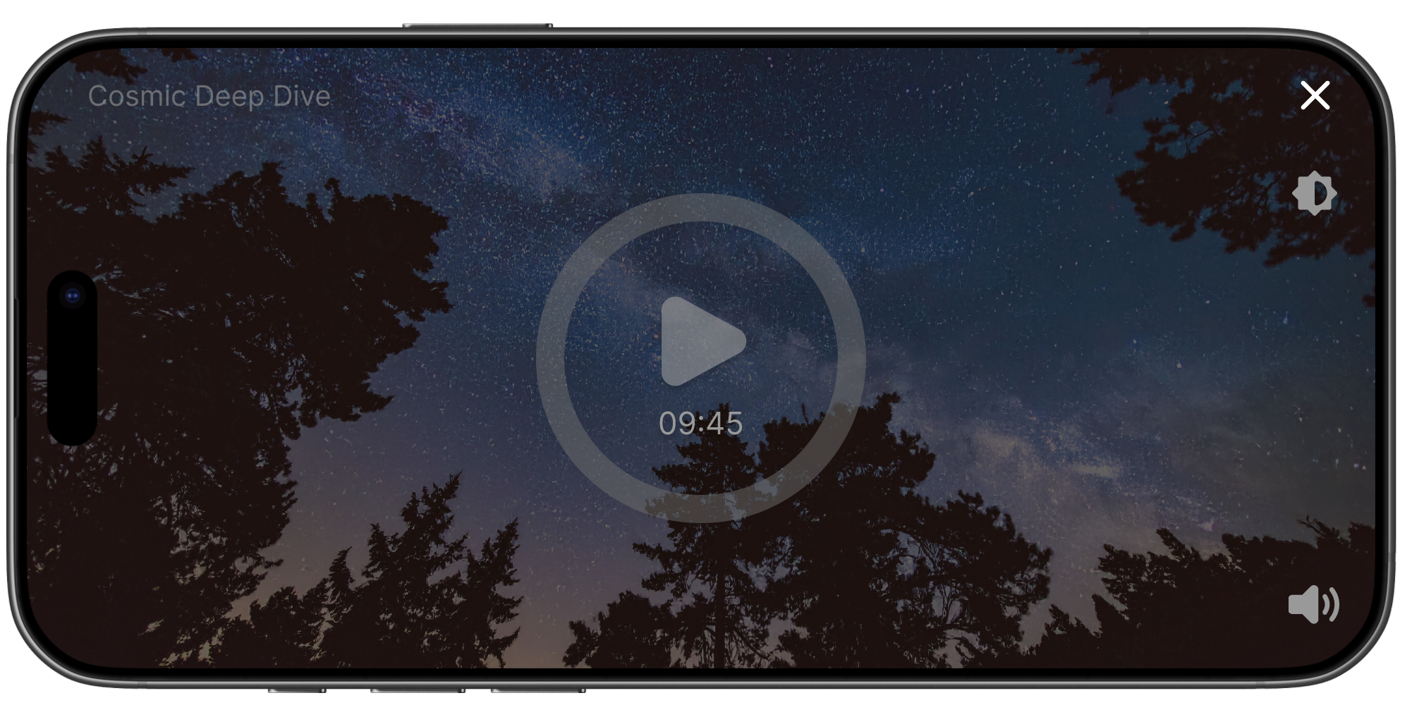
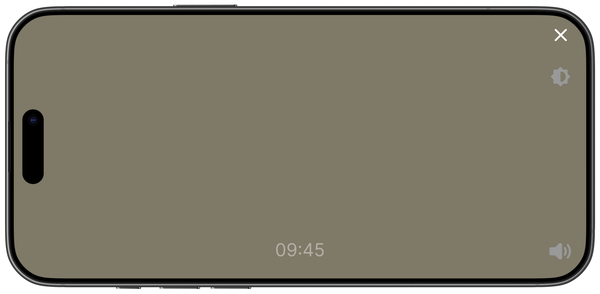
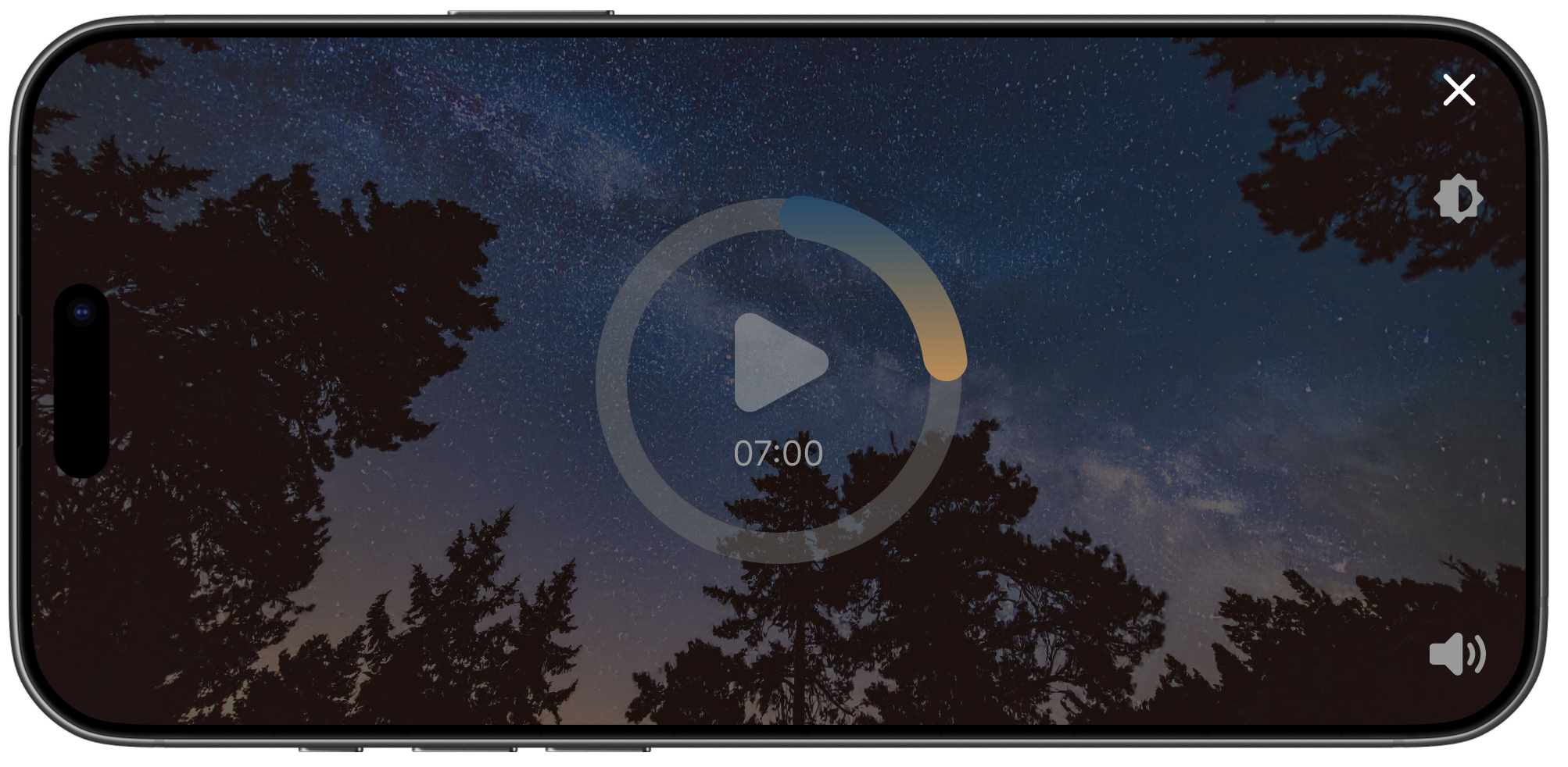
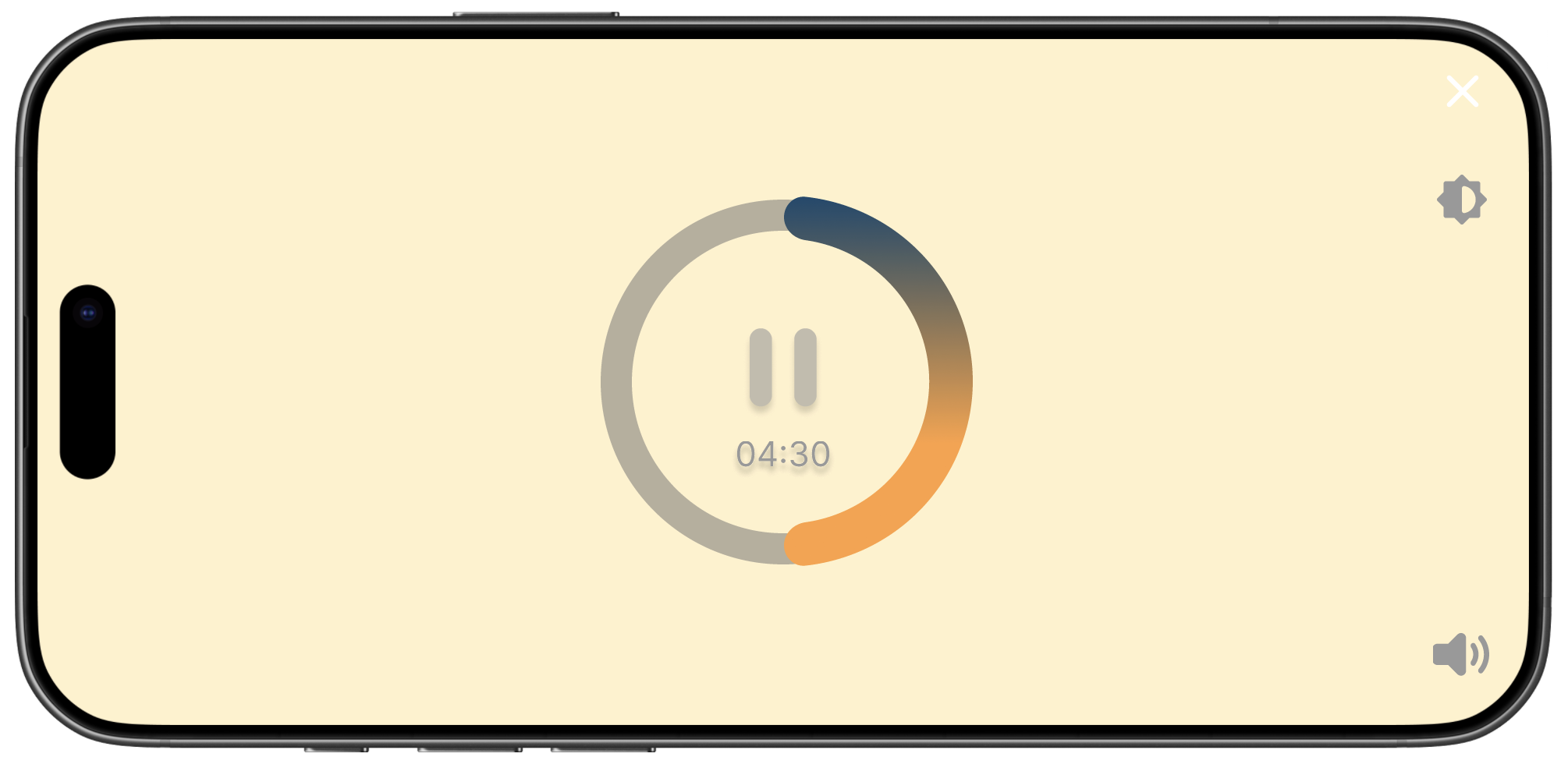
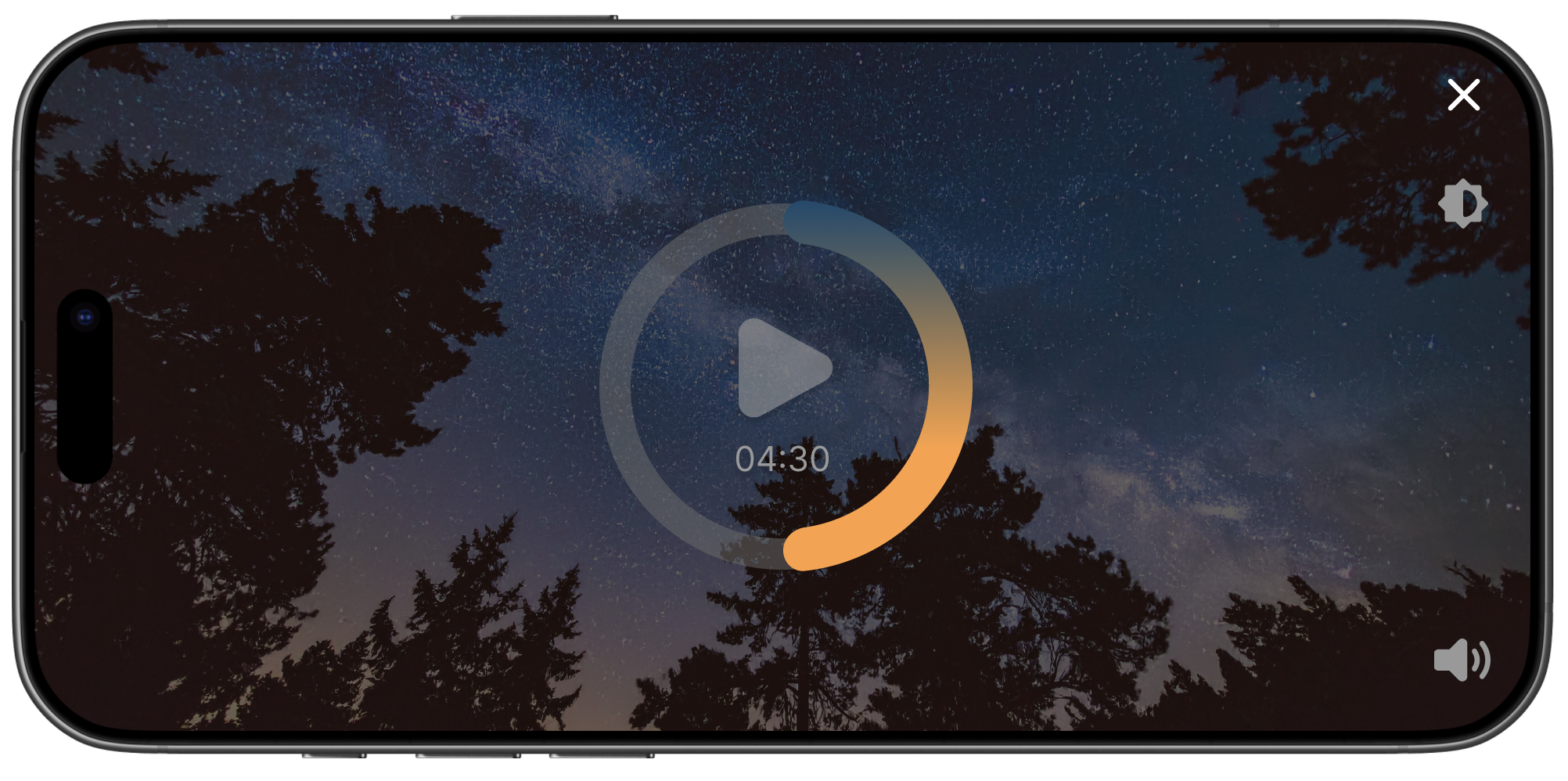
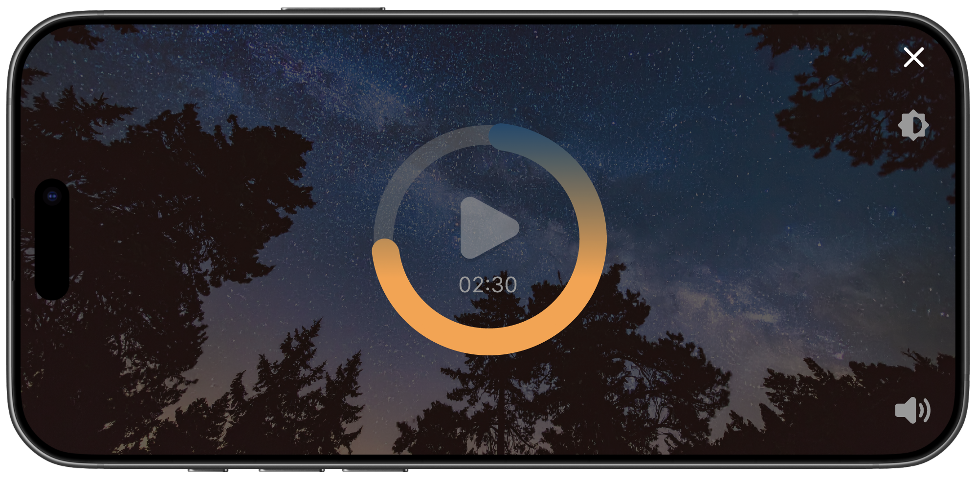
Session Player & Session Animation
Designing the user journey of launching a light and session from the homescreen included many elements. First, creating a 5-second animation (including music) using the imagery of the session card to generate intrigue and ground the user before they began the session.
Next, re-designing the session player controls into a more modern aesthetic using the brand colors to illustrate the duration progress in a circular format rather than a linear timeline from left to right. (All session controls including the play/pause buttons, brightness control, and mute function are automatically hidden when the session is playing and the light is flickering.)
Lastly, including a post-session survey to gather insights from the user such as a ‘thumbs-up’ rating system to gather data for personalization, and feedback specifically about the content of each session to validate if we met their expectations (based on the session card, text description, benefits, and categorization).
New User Onboarding
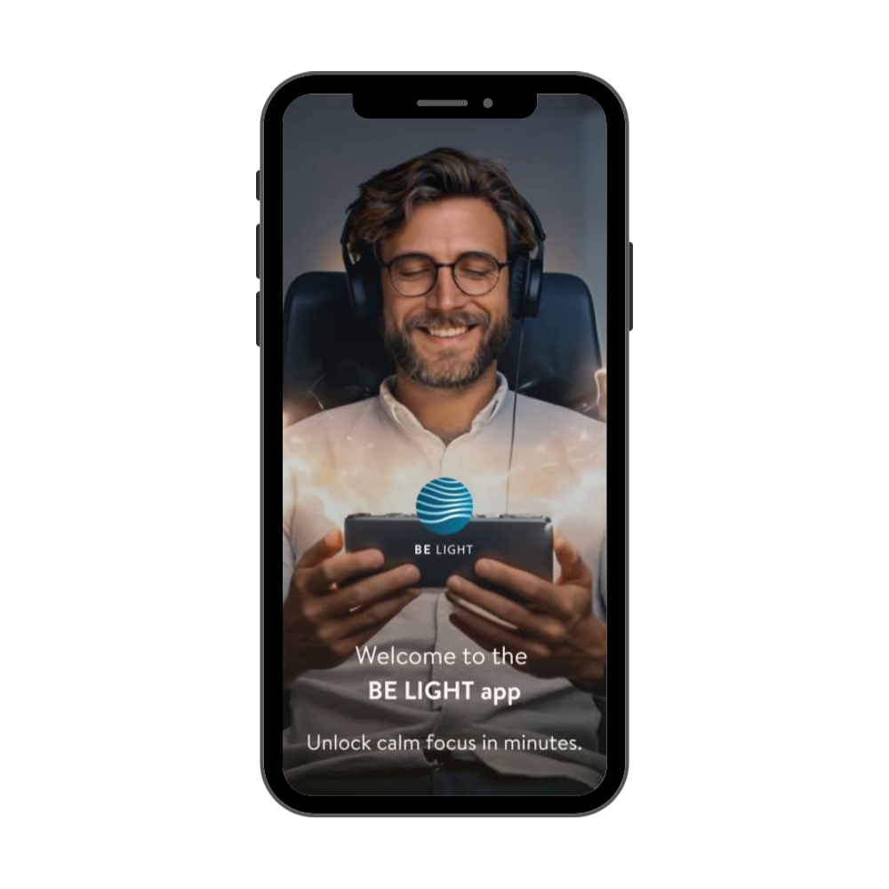
As part of the user journey for new users, I designed a prototype to illustrate the onboarding process of introducing the BE LIGHT product, science behind the light and sound and the set-up instructions for the user to start their first session. With the implementation of recorded videos, I created overlay screens with clear call-to-actions: “Watch next video, Discover the App, and Re-watch previous video” to appear at the end of each video. All images were generated with GenAI using specific prompting, following BE LIGHT’s brand guidelines to create realistic scenarios of our ideal client using the BE LIGHT product in the privacy at home or quietly in the office.
Downloads Page
One of the features to enable personalization for the user was a Downloads Page to access all of the user’s downloaded sessions while offline. Following the minimalist UI and behavior of popular media players such as Spotify, the user must long press and hold each session manually on the downloads page to bring up the selection checkboxes and can either remove a single session or ‘Select All’ to remove all downloads and clear their storage.
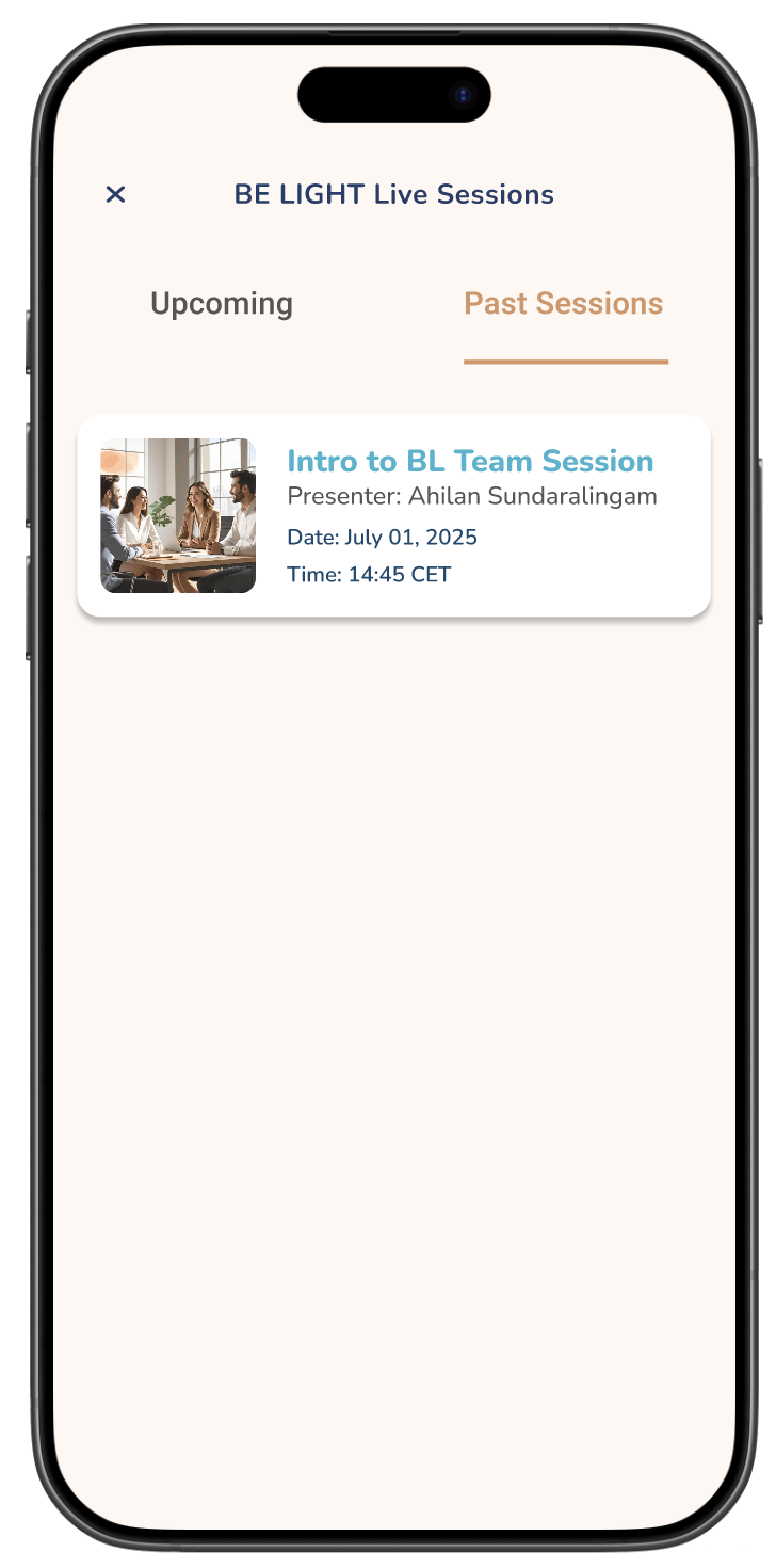
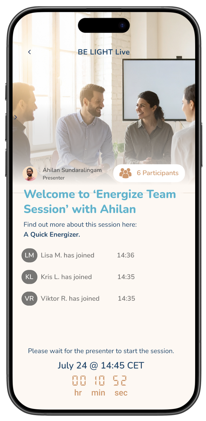
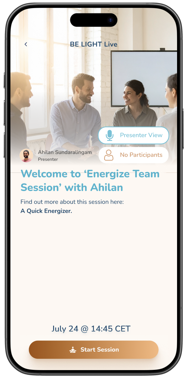
Live Team Sessions
One of the requested features to incentivize our corporate wellbeing program was to launch the Live Team Sessions feature which allowed users (employees of the same company or institution) to join a live BE LIGHT session together.
From creating a new navigation icon on the homescreen to enhance the visibility to the user, to designing a waiting room for each of the team members to enter before beginning a session, this feature was beta-tested internally but did not make it to production on the live app.
Beta Testing & Key Learnings
Profile Page:
As we are improving the user’s personalized preferences through post-session feedback, we want to incorporate their ratings into their user dashboard using different classifications such as “Top 5 Lists”, Popular sessions, and Most Replayed Session(s).
We want to incentivize the user to continue building long-term habits not only with milestone badges and awards but also with virtual challenges that they can publicly post about and share with their followers on their profile.
Homescreen:
Based on ongoing user interviews, and current in-app feedback, I would like to re-design the information architecture of the homescreen; namely, creating new categories to organize the sessions based on the user’s personalized preferences, current progress in virtual challenges, and session activity based on close friends and followers in-app.
Session Design:
To improve user retention and engagement, I would like to analyze and track the average user’s drop-off rate of each session to determine how we can best inform and educate the user of their experience of the light and sound sessions so it matches closer to their expectations.
Some sessions perform better than others in terms of retention and replay rate; the sessions that are more ambiguous in performance will be further A/B tested to determine if the any of the variable factors need to be changed (i.e. session title, session type, session card design, session description & benefits)
Overall, the emergence of audiovisual brainwave entrainment is a very niche market, however, finding the right corporate wellbeing clients and addressing their pain points of finding a fast, effective solution to reset their nervous system in an easy and accessible way is the key underlining USP of BE LIGHT. BE LIGHT hope to expand their offerings into the digital wearables space, collecting opt-in biometric data and emotional responses to improve user experience.